
Summary
- Plugin name : Time-frequency map display
- Version : 0.1
- Author : Vincent Delannoy
- Company : INRIA/IRISA
- Short description : 2D time-frequency map
- Documentation template generation date : May 20 2016
Description
A Time-Frequency (TF) map displays power spectra of signals over time, making it possible to track changes in amplitudes over a given time span. To that end, it uses a color scale to convert amplitudes to colors. This makes it possible to represent a single spectrum as a column of color-coded blocks. As time goes by, they are shifted to the left of the graph to make room for more recent spectra. There is one map per channel.
Depending on the resolution of the map, a variable number of frequency bands are displayed per spectrum, or column of the map. If the number of frequency bands equals the height of the map for a given channel, each frequency band is one pixel high. Smaller maps won't be able to display all frequency bands, while in bigger maps, each frequency band will be allotted an area that is one pixel high or more.
Since a TF map displays a series of power spectra, input data should be preprocessed by a Spectral Analysis box, as is the case with the Power Spectrum plugin. See Power spectrum display for an example, and Doc_BoxAlgorithm_SpectralAnalysis for more information.
Inputs
1. Spectrum
Power spectrum of each channel to display.
- Type identifier : Spectrum (0x1f261c0a, 0x593bf6bd)
Settings
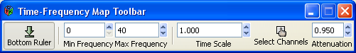
Online options include :
- Bottom Ruler : this button toggles time values on/off.
- Min/Max Frequency : the range of frequency bands that are drawn may be adjusted with these buttons.
- Time Scale : this setting adjusts the time span displayed by the plugin.
- Select Channels : clicking this button pops up a dialog that allows to show/hide some of the channels.
- Attenuation : this setting allows to gradually adapt color thresholds. Valid values are in the [0,1] interval.
1. Time Scale
Size of time window to display.
- Type identifier : Float (0x512a166f, 0x5c3ef83f)
- Default value : [ 10 ]
2. Minimum frequency to display
Minimum frequency to display in time frequency maps.
- Type identifier : Float (0x512a166f, 0x5c3ef83f)
- Default value : [ 0 ]
3. Maximum frequency to display
Maximum frequency to display in time frequency maps.
- Type identifier : Float (0x512a166f, 0x5c3ef83f)
- Default value : [ 40 ]
Online visualisation settings
Examples
Practical example :
This example is based on the following scenario file : tutorials/visualisation/sample_time_frequency_map
To test this plugin, one can extend the Doc_DataVisualisation_2DVisualisation_PowerSpectrum example by adding a Time-Frequency Map plugin. Since Sinus Oscillator signals are made up of sinusoidal signals with frequencies in the [0-50Hz] range, one should make sure the minimum and maximum displayed frequencies settings of the Power Spectrum and TF Map plugins match this range. Results should look like the following screenshot.
A few remarks :
- For now, there is no frequency scale displayed to the left of the maps. Frequencies are mapped from bottom to top for each channel.
- TF maps don't change much over time, which is logical since power spectra displayed by the Power Spectrum box are pretty much constant themselves. This translates into (almost uninterrupted) horizontal lines in the TF maps.
- Finally, one can notice two dominant frequency bands in the power spectrum of each channel, where they stand out as high amplitude peaks. These bands translate into dark horizontal lines in the TF maps.
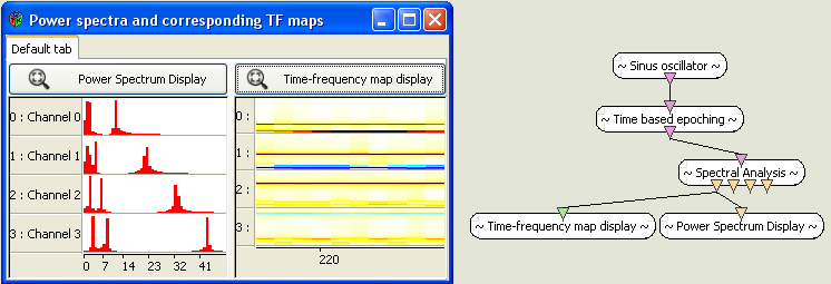
history" displayed over the last 10 seconds using the TF map plugin."
Miscellaneous
Generated on Tue Jun 26 2012 15:25:54 for Documentation by
 1.7.4
1.7.4